Designing My Personal Business Card
Designing My Personal Business Card
Before heading to #THATconference, I prepared a small set of business cards to help with networking. Thankfully, I have a lot of design-conscious friends and could use them to test and critique the numerous revisions that my personal card went through. I thought I'd share part of that design process.
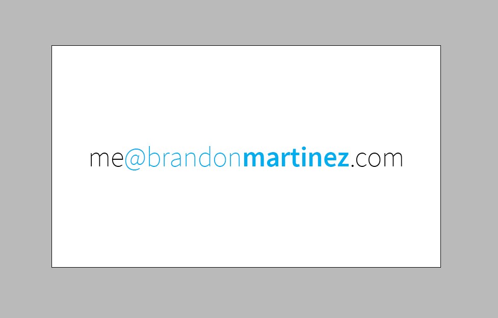
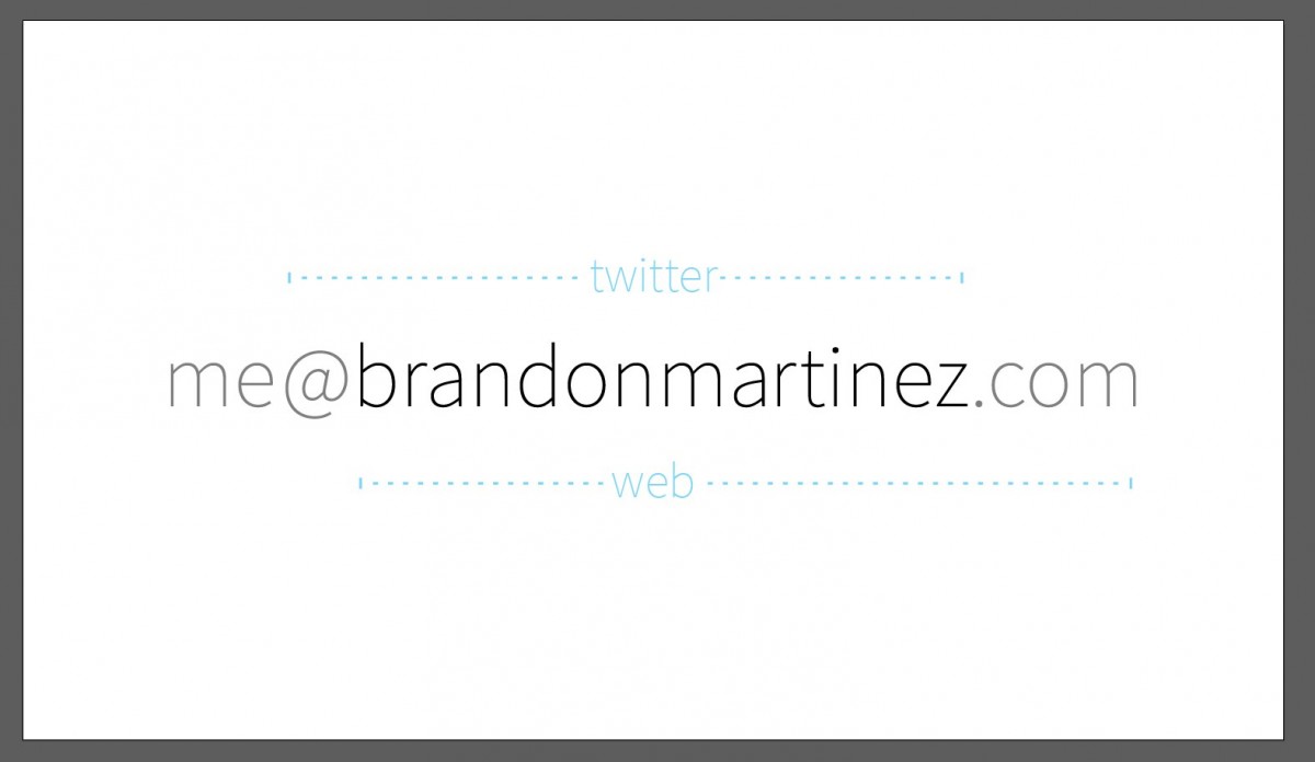
I wanted a card that would say who I am, specify a few methods of contact, and be clean and simple. This is the initial idea that came to me:
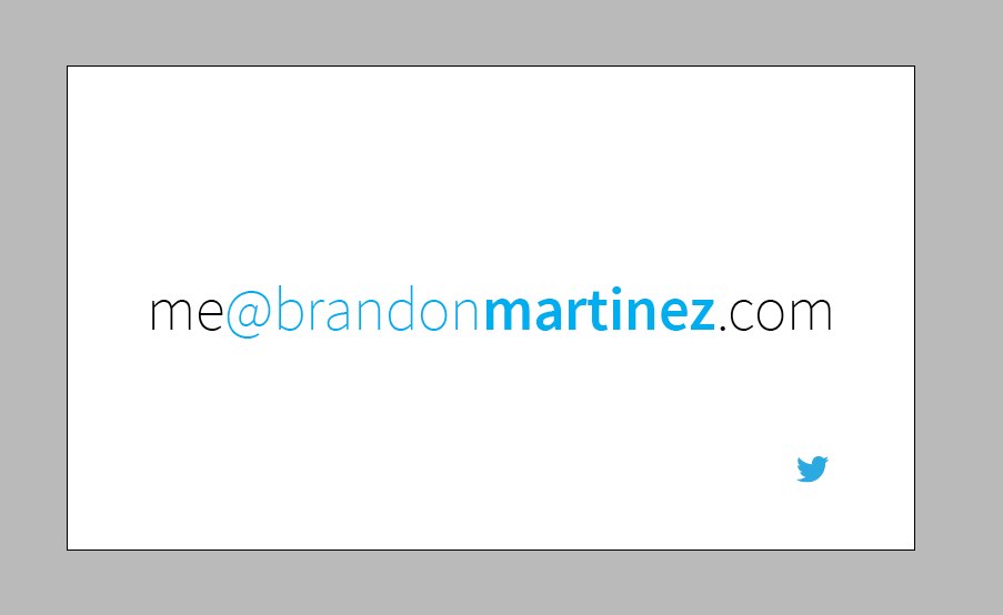
Essentially, it's a combination of four things: my name (front and center), my email address (the entire text), my web address (part of the email), and my twitter handle (the part in twitter-blue). After getting some feedback from my "focus group", people didn't realize it was "twitter-blue". I thought a legend might help:
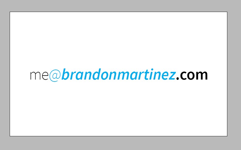
Nope, that's kind of awkward and feels out of place with the rest of the design. Dropped! I'll deal with that issue later. I'll focus on emphasizing the various parts. Here I put the web address in bold to distinguish it from the email address:
And then put my name in italics to help that stand out:
And then I decided it was ugly. Back to base!
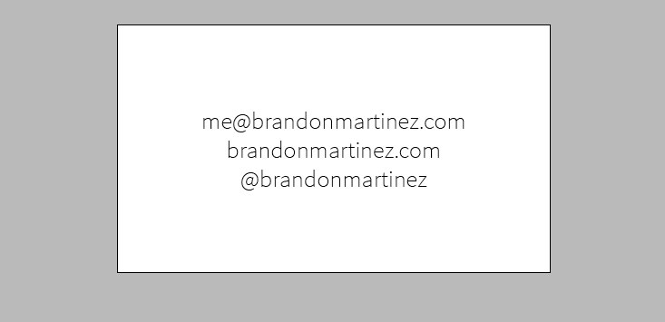
Let's expand our design into its parts again:
Alright, what if I combine them, but just say what they are on the card?
Well, that's not terrible. Time to refine:
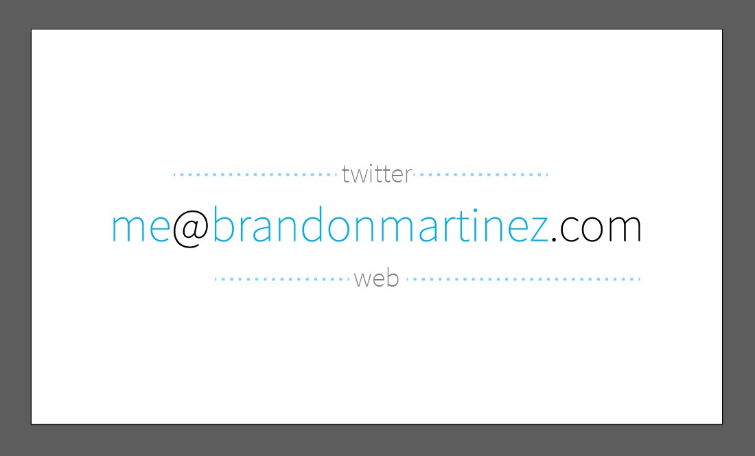
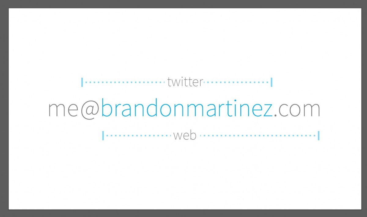
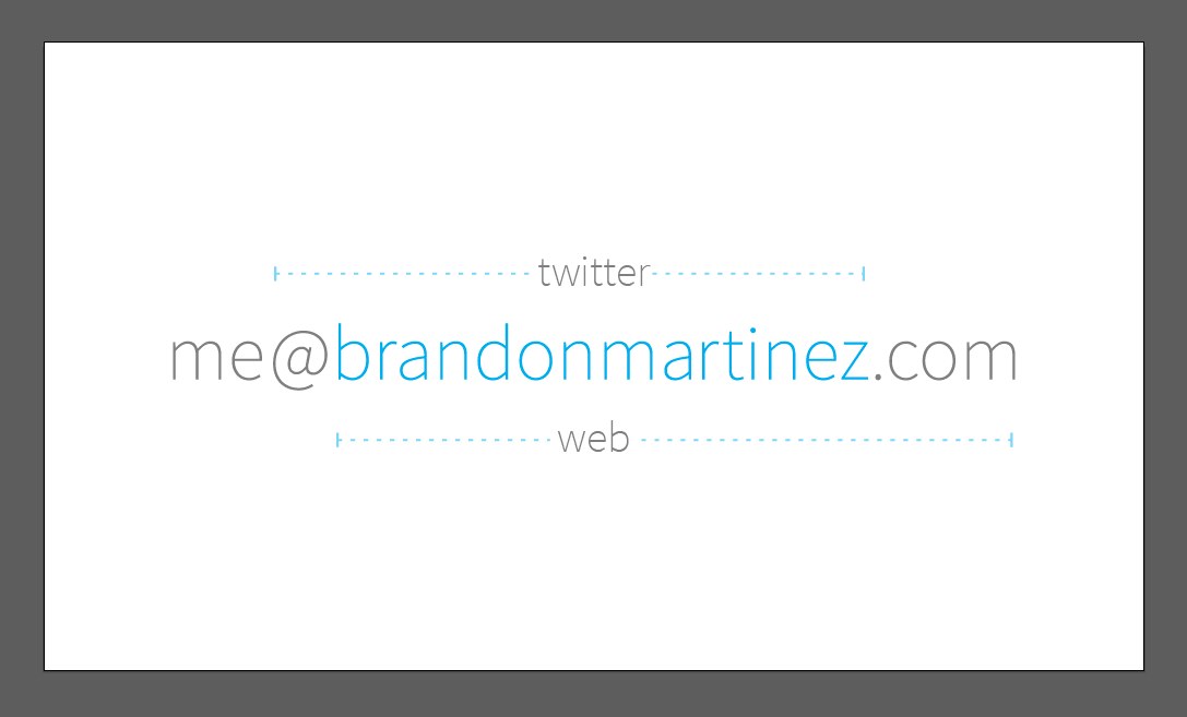
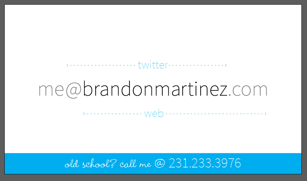
The dots span the length of the component they're describing. I decided to not include "email" because its format is a "universal truth" and doesn't need a description. I put my name in color to help it stand out since, you know, this card's for me.
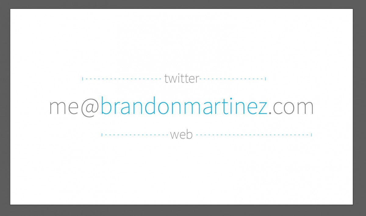
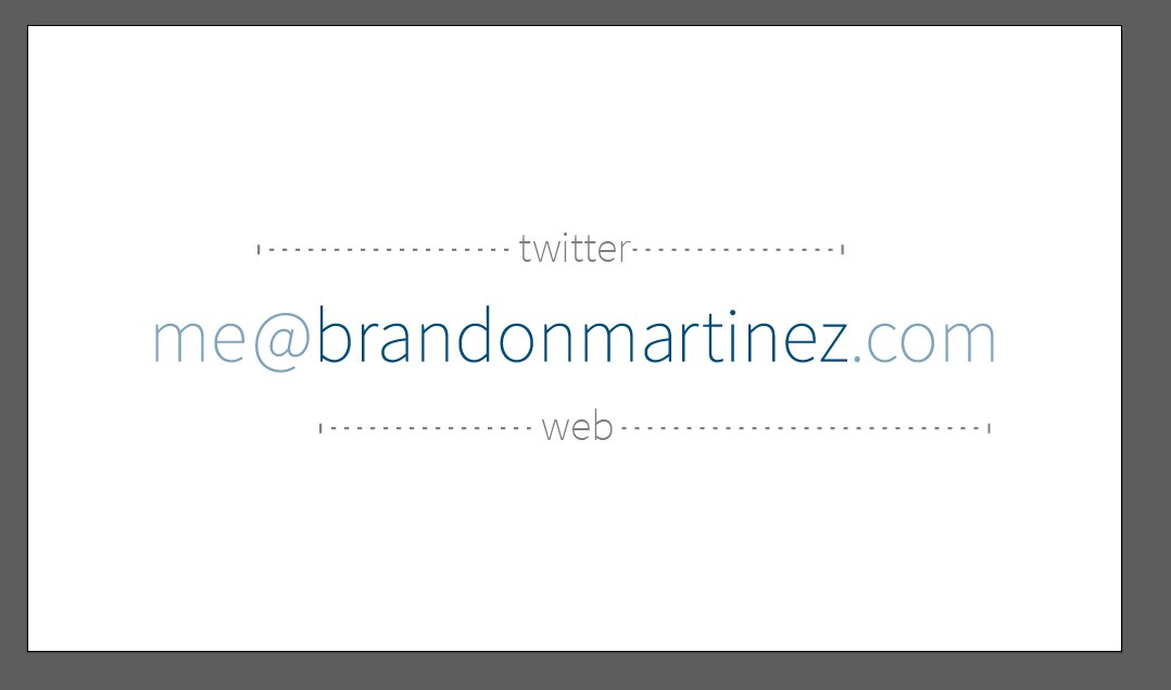
Tweaking the weight and color:
Dropped the color from my name; it was blending into the "helper text".
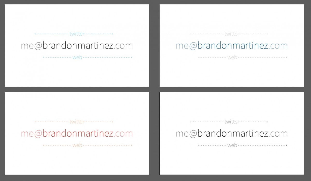
Trying a color variation:
Multiple variations:
I ended up sticking with the original color scheme. While my focus group" was all over the place with what color scheme they liked the best, I felt the cyan had the best color balance and presentation on the card
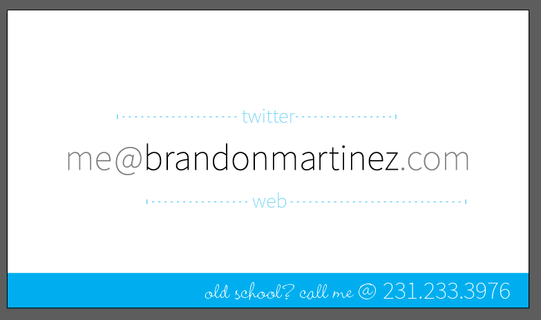
A constant suggestion I was getting was that I really should included my phone number. Not everyone wants to communicate digitally, so having an option for a voice-to-voice combination opens up the channels. The first implementation of that wasn't pretty, though:
That design was losing the focus I set out with, to be simple and clean while presenting a decent amount of information. I switched back to the old layout and then put a bar at the bottom to contain the added info; also, since I wanted this to be a secondary form of a contact, I added some "cutesy" text:
Trying out a centered alignment:
Lots of dislike from the focus group on the font selection, trying something more traditional:
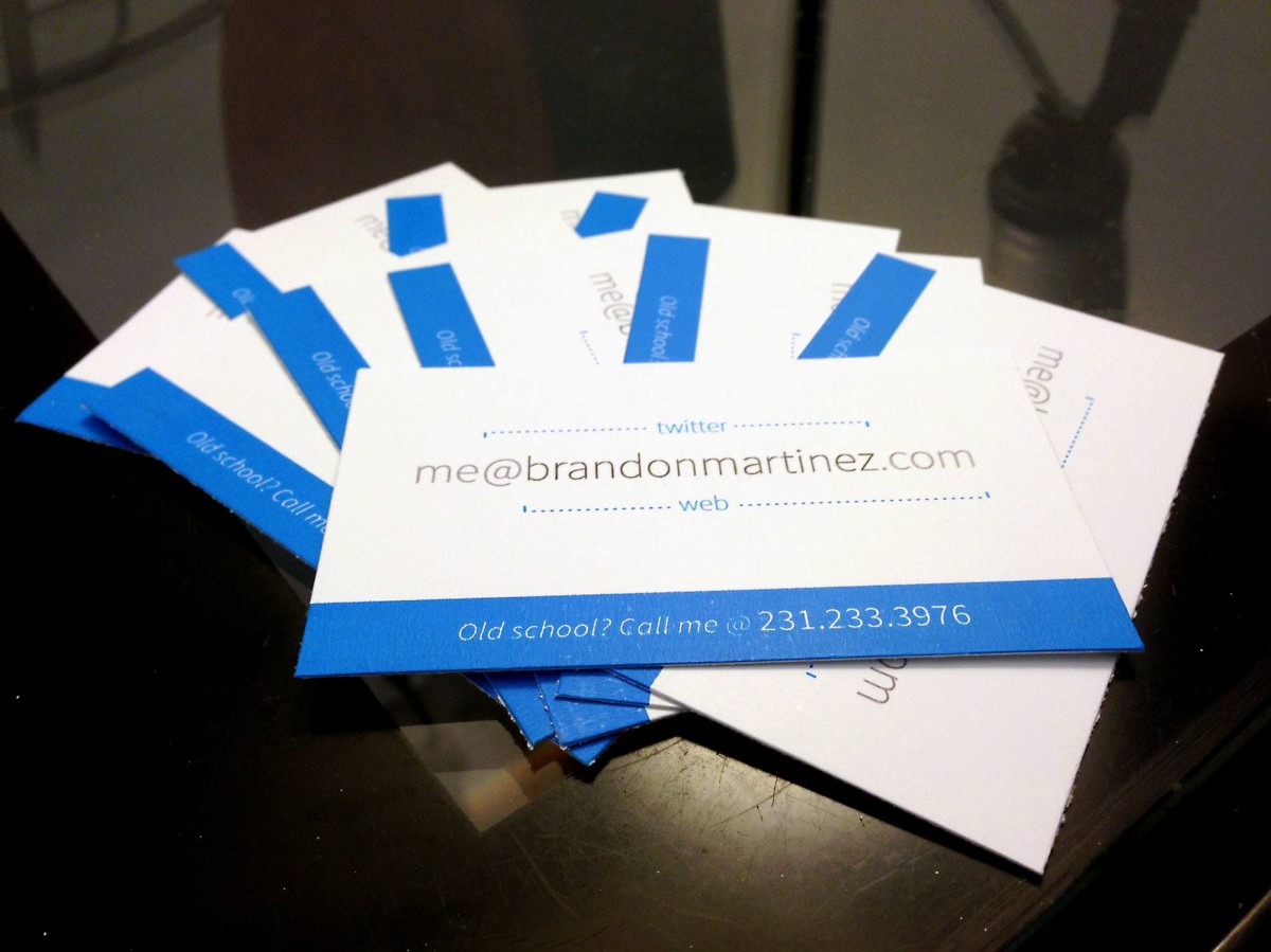
And now we're in business! Lots of good feedback on the design, and I was pretty happy with how it looked. All of my initial goals were achieved as well as the added bonus of having a phone number on the card. Time to create a prototype:
Excellent! Off to the presses!
In usage (at #THATconference), I got a lot of good feedback on the card: clever, clean, unique, different. Sadly, I have no way of tracking whether someone used that as an entry point to contact me, but at the very least it promotes me as having a brand.
Thanks again to everyone that helped by being my focus group; your feedback was much appreciated and helpful.
